Chowplug - Redefining Food Delivery with Flavourful Precision
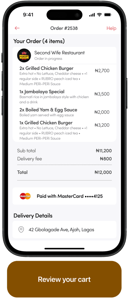
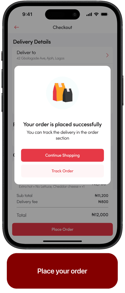
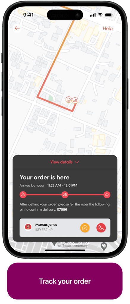
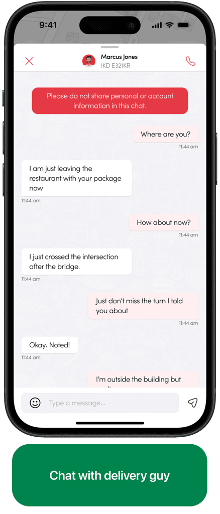
ChowPlug is a mobile app that transforms food delivery, offering a curated mix of local and gourmet dishes through a user-friendly interface. Using smart technology, ChowPlug personalizes dining options based on user preferences, dietary needs, and past orders.
UX Design
Mobile App design
Food delivery
Overview
The food delivery landscape is evolving rapidly, with an increasing number of platforms vying for consumer attention. Our challenge with ChowPlug was twofold:
To create a mobile app that seamlessly connects users with a diverse array of culinary options.
To address the common pain points associated with food delivery — reliability, variety, and an engaging user experience.
Our goal was to design a solution that goes beyond mere transactional efficiency, offering a delightful and reliable journey for every food enthusiast.
Concept & approach
We wanted to bridge the gap between user needs and business goals. The sweet spot was to meet user needs which generally translates to profit margins for the business.
But how do we do this?
Identify the business goals and;
Identify the user needs
The business goal was simple - Become the largest food ordering platform in Nigeria and squeeze out as much profit margins as possible.
To understand the user needs, we needed to speak with them, hear their views and basically find out problems they’re currently facing and then we come up with matching solutions.
The research
Because there were a lot of platforms that were already offering this service, we first spoke to our target customers (which were basically anyone who wants to order food), to use which platforms they used and what features they liked and didn’t like.
Our interviews were mainly centered around:
“ How they currently ordered meals, pay and get them delivered ”
“ Challenges they faced when trying to order meals and pay”
“ Their ideal/preferred ways of ordering meals and delivery”
Key findings:
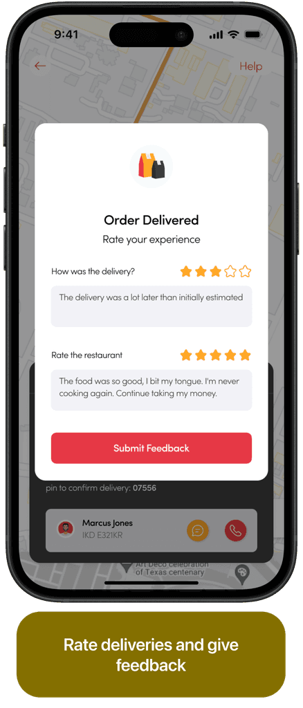
75% of the interviewees complained of complexities in the interface especially during checkout.
65% of them suggested that delivery fees were exhorbitanat on some of the apps that they used.
85% of interviewees complained of slow delivery of meals and poor response of delivery guys on chats and calls.
80% of them suggested a feature that will enable them order meals to different locations remotely.
Feature prioritization
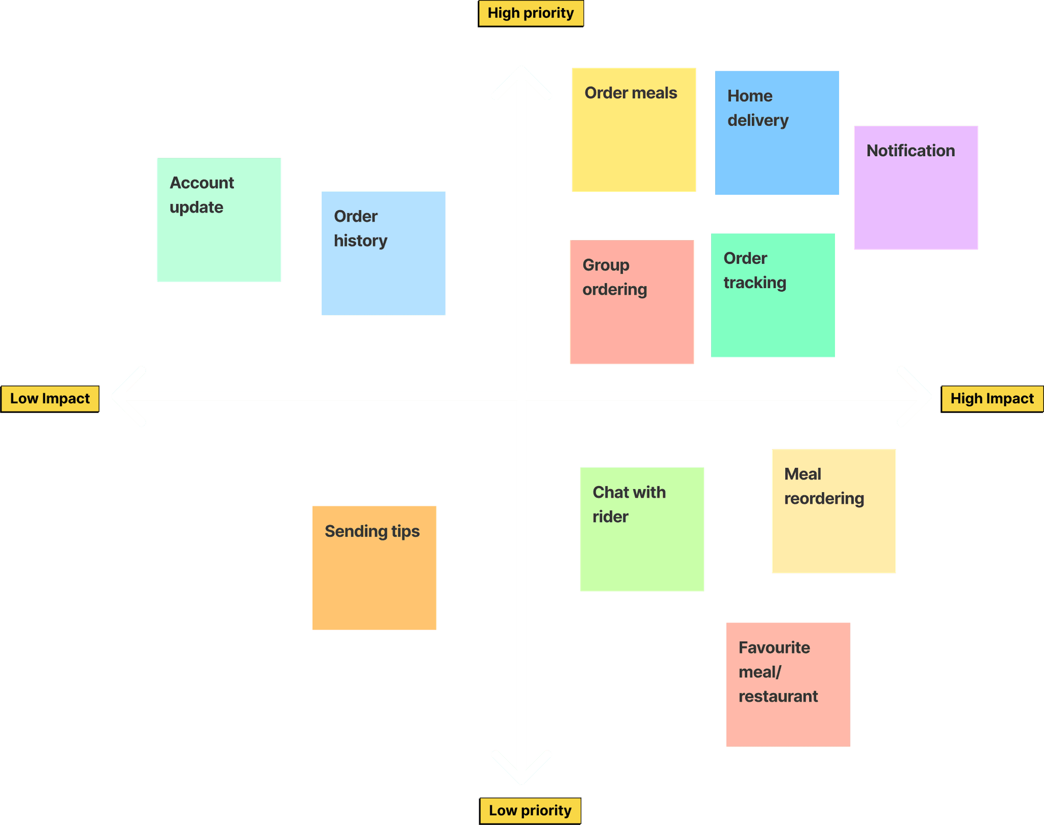
At this point we had identified the user needs and also brainstormed possible solutions to their problems, but it wasn’t possible to integrate all the solutions at once.
The goal of the exercise is to work on features that have high impact on potential customers. Hence the need for us to prioritize features that had the highest impact and ditch less important ones for now.
The design
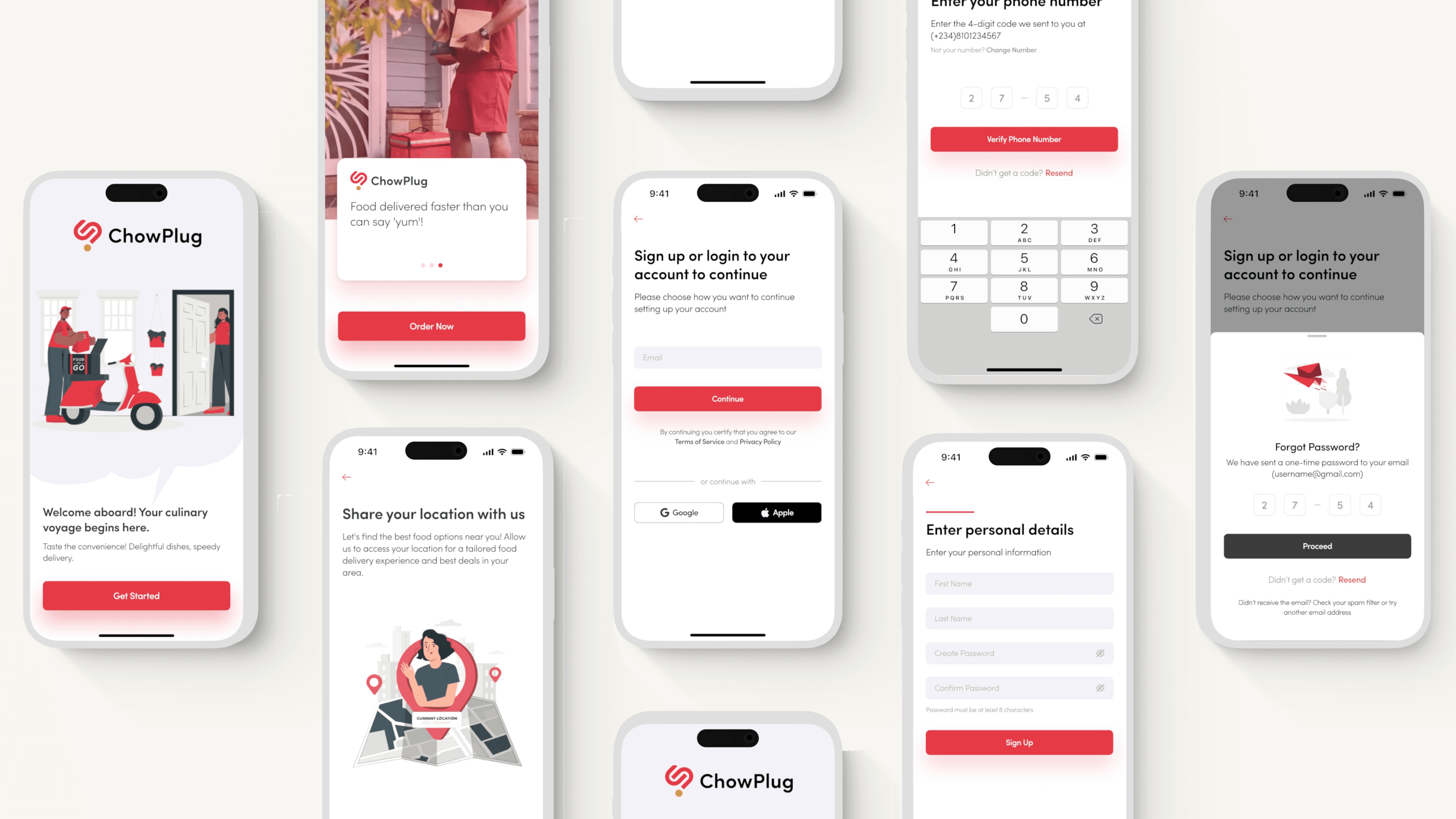
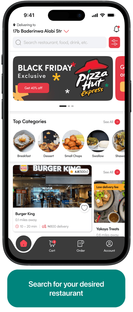
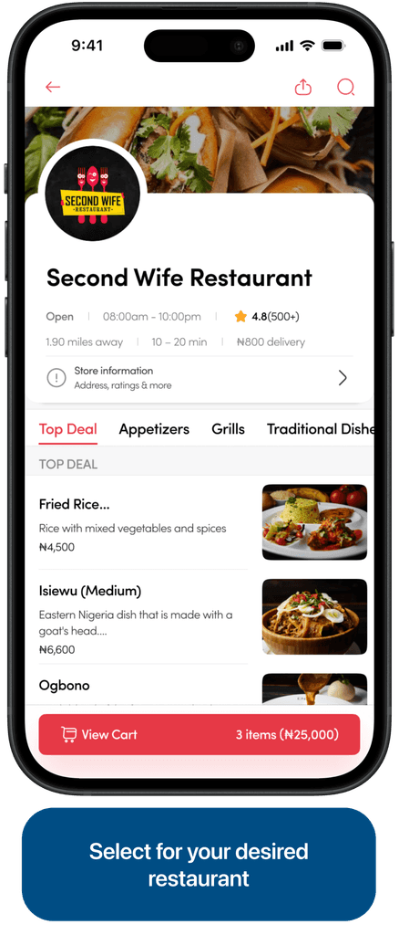
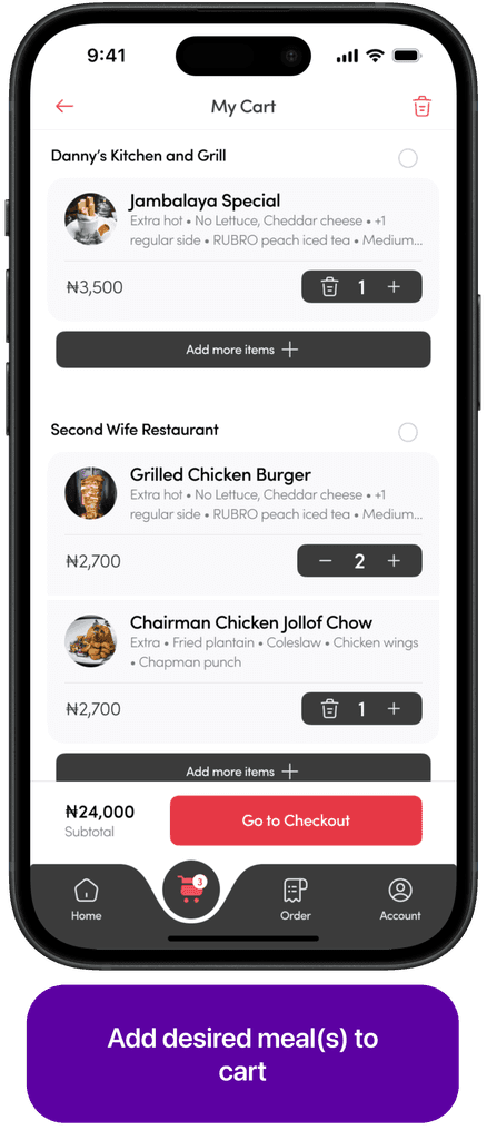
Once we agreed on the features we wanted in our version 1, we proceeded to synthesizing the mobile app design. First we came up with a user flow that works, then created wireframes.
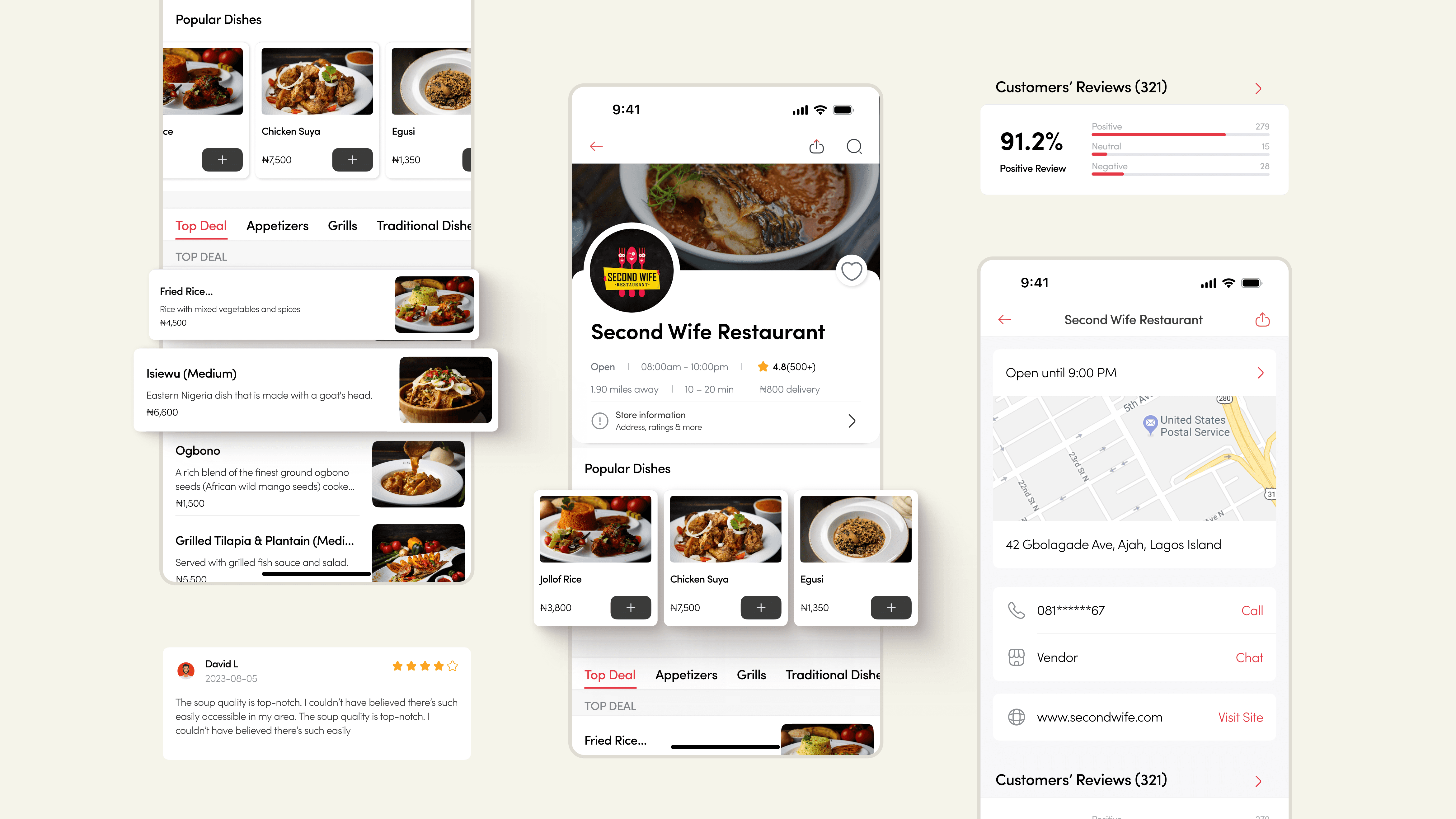
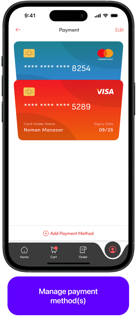
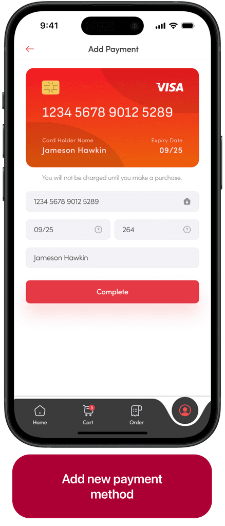
We combined insights from research and the branding to craft the mobile app design, ensuring it is clean and the layout structure is straight-forward and user-friendly. The design was also modern and unique, exhibiting the strong and vibrant identity ensuring swiftmonie is recognizable as customers use the application.
Reflective Summary
This project was more than a display of technical prowess—it was a journey of professional and personal growth. It taught me the value of empathy in design, the power of data-driven decision-making, and the importance of clear communication.
Thanks for reading!!
