Chowplug
Redefining Food Delivery with Flavourful Precision
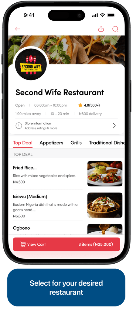
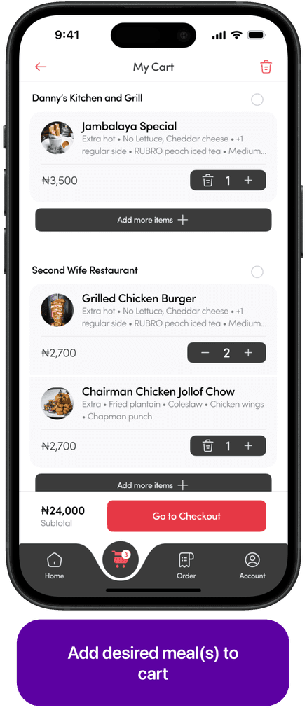
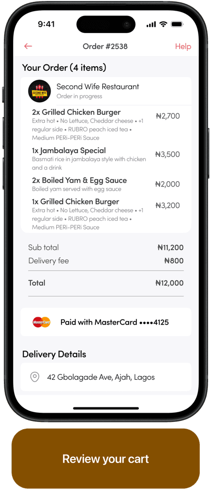
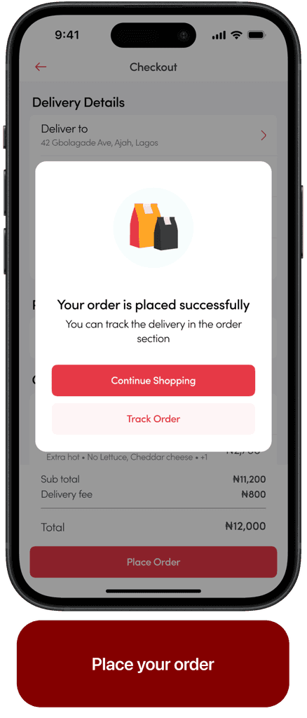
ChowPlug is a mobile app that transforms food delivery, offering a curated mix of local and gourmet dishes through a user-friendly interface. Using smart technology, ChowPlug personalizes dining options based on user preferences, dietary needs, and past orders.
My Role
Lead Designer — Feature Scoping, Research, Interaction Design, Visual Design, Prototyping
Team
Hamza Abdul (Me), UX designer, UX researcher, Framer developer
Oluwasegun Aderibigbe, UX designer, brand & Motion designer
James Balogun, Project manager
Timeline & Status
5 Months, Completed
My Role
Chowplug was a passion project borne from the challenges me and my friends face whenever we order meals and not get them as quickly as needed. My contributions were centered around research, planning, idea scoping and design implementation.
Part of what I did was speak to people facing similar challenges that we currently faced, ideated solutions with my team members, create wireframes and hi-fidelity design
Overview
The food delivery landscape is evolving rapidly, with an increasing number of platforms vying for consumer attention. Our challenge with ChowPlug was twofold:
To create a mobile app that seamlessly connects users with a diverse array of culinary options.
To address the common pain points associated with food delivery — reliability, variety, and an engaging user experience.
Our goal was to design a solution that goes beyond mere transactional efficiency, offering a delightful and reliable journey for every food enthusiast.
Concept & approach
We wanted to bridge the gap between user needs and business goals. The sweet spot was to meet user needs which generally translates to profit margins for the business.
But how do we do this?
Identify the business goals and;
Identify the user needs
The business goal was simple - Become the largest food ordering platform in Nigeria and squeeze out as much profit margins as possible.
To understand the user needs, we needed to speak with them, hear their views and basically find out problems they’re currently facing and then we come up with matching solutions.
The research
Because there were a lot of platforms that were already offering this service, we first spoke to our target customers (which were basically anyone who wants to order food), to use which platforms they used and what features they liked and didn’t like.
Our interviews were mainly centered around:
Key findings:
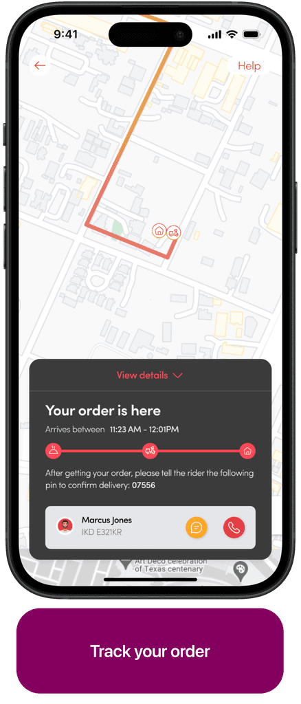
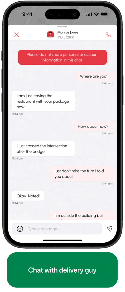
85% of interviewees complained of slow delivery of meals and poor response of delivery guys on chats and calls.
80% of them suggested a feature that will enable them order meals to different locations remotely.
Competitor analysis
From the comments of the participants we interviewed, we followed up on market research and competitor analysis on most used platforms that they mentioned. these included:
1. Uber eats, 2. Doordash and; 3. Postmates
Key findings:
A major feature consistent amongst all the apps was really consistent user interface and from from placing orders to delivery.
The home of the doordash App is dominated by too many ads which may stay users away from its basic function.
Doordash app has unique feel using fun illustrations of food categories and custom icons throughout.
Postmates has very good filter options like fast delivery time, most viewed restaurant, and ability to re-order meals.
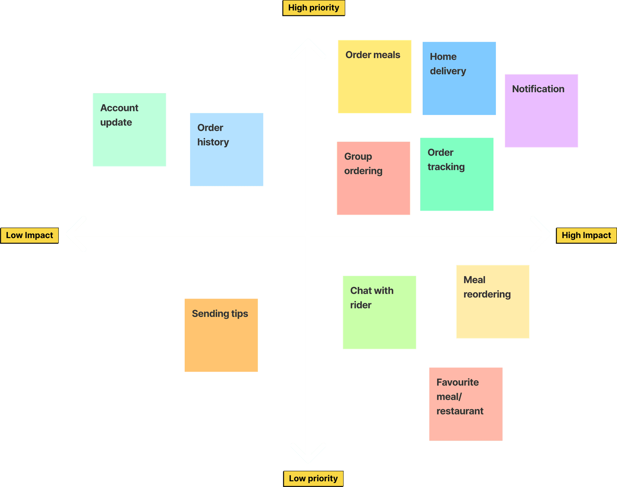
Feature prioritization
At this point we had identified the user needs and also brainstormed possible solutions to their problems, but it wasn’t possible to integrate all the solutions at once.
The goal of the exercise is to work on features that have high impact on potential customers. Hence the need for us to prioritize features that had the highest impact and ditch less important ones for now.
The App design
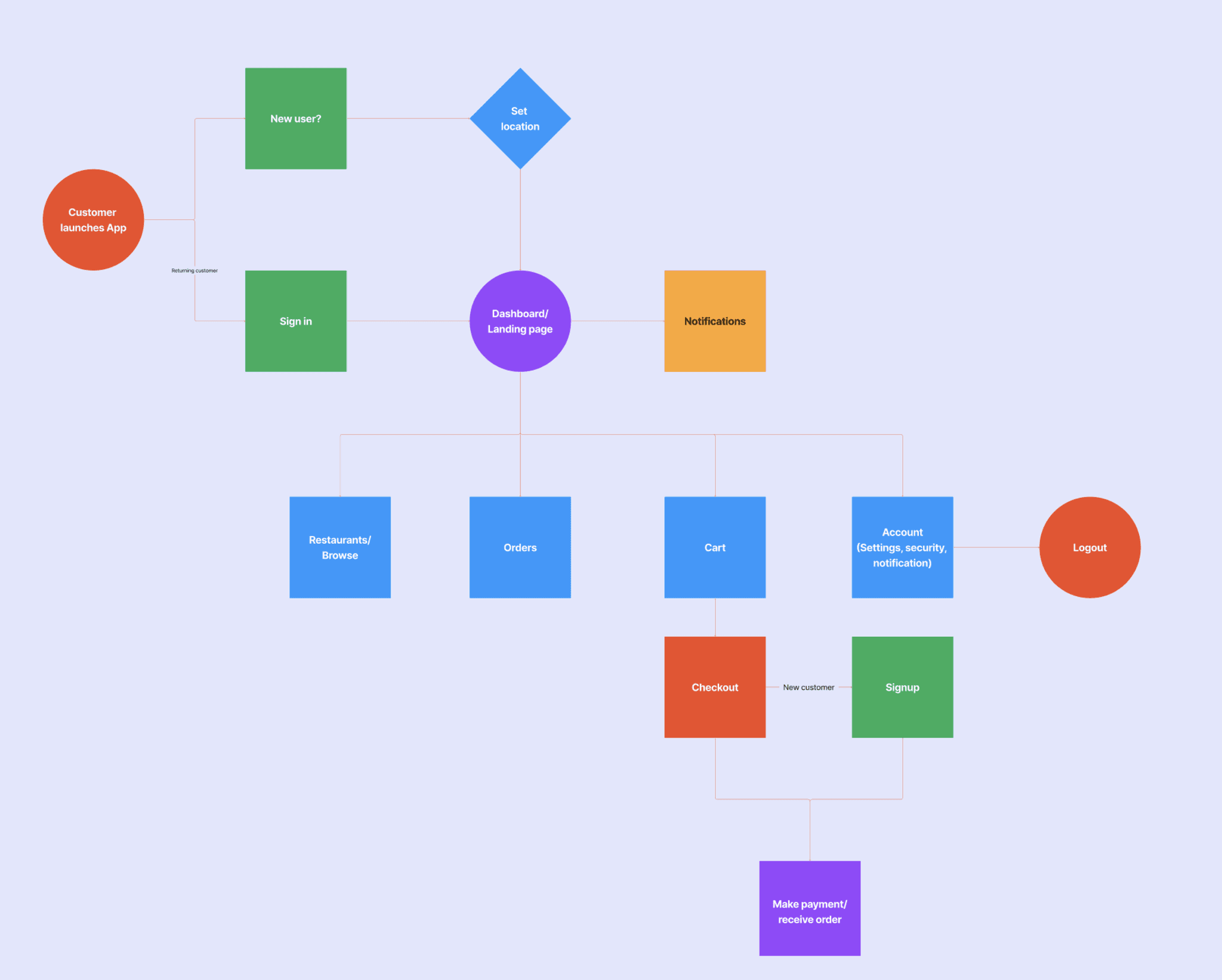
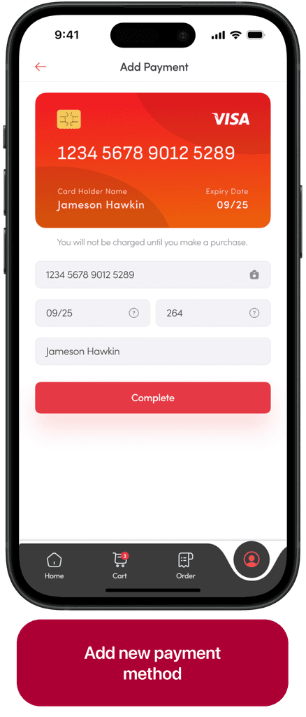
Once we agreed on the features we wanted in our version 1, we proceeded to synthesizing the mobile app design. First we came up with a user flow that works, then created wireframes.
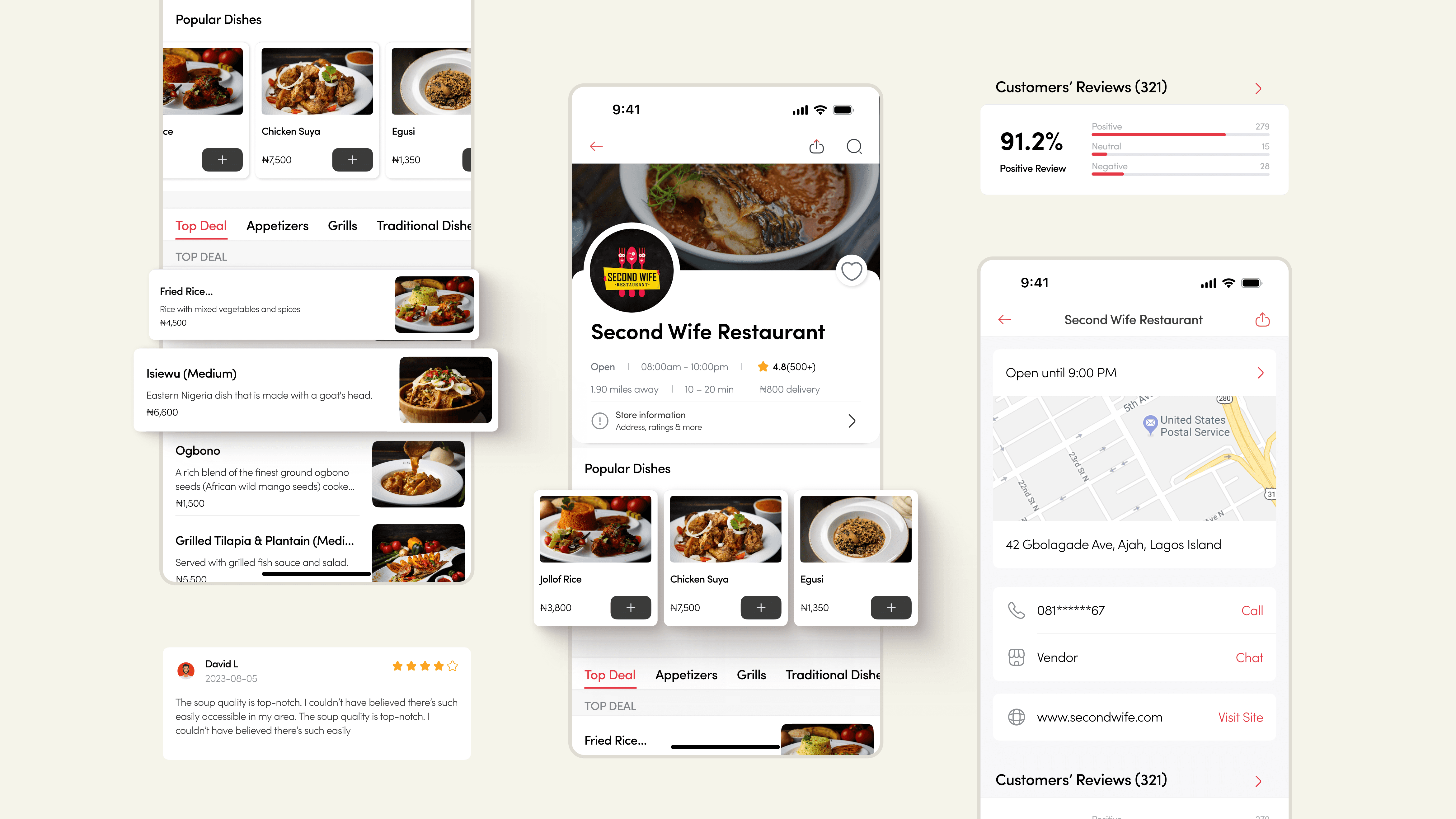
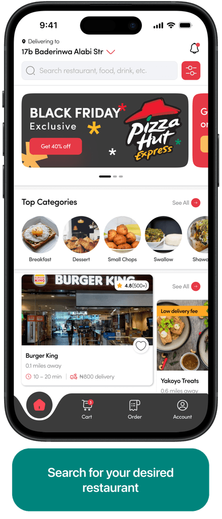
We combined insights from research and the branding to craft the mobile app design, ensuring it is clean and the layout structure is straight-forward and user-friendly.
The design was also modern and unique, exhibiting the strong and vibrant identity ensuring swiftmonie is recognizable as customers use the application.
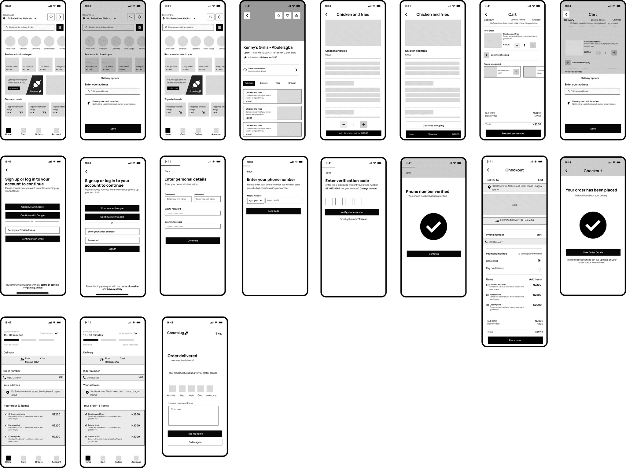
App wireframes
The wireframe was created using the user flow as a guide. We prototyped the wireframe, tested it with the different group of people without guidance, and followed up with some questions to see:
If the navigation was intuitive
If they were able to complete the tasks given
How they felt during the process
If there were missing features they would have found useful
The design was also modern and unique, exhibiting the strong and vibrant identity ensuring swiftmonie is recognizable as customers use the application.
The branding
With the brand identity in consideration, we created a simple design system defining the color palette, font style, icon set, base system, grids, and using the atomic approach to create components.
To give users a more familiar and smooth experience, we weaved engaging micro-interactions and animation into every point in the app. The brand utilizes a Rich Red as the primary color for vibrancy and energy, complemented by Creamy Beige for a clean, modern feel.
Accents of Orange Burst add freshness, while the Charcoal Black and Blue Teal bring balance and depth. Light Grey is used for background elements, ensuring readability and focus on primary content.
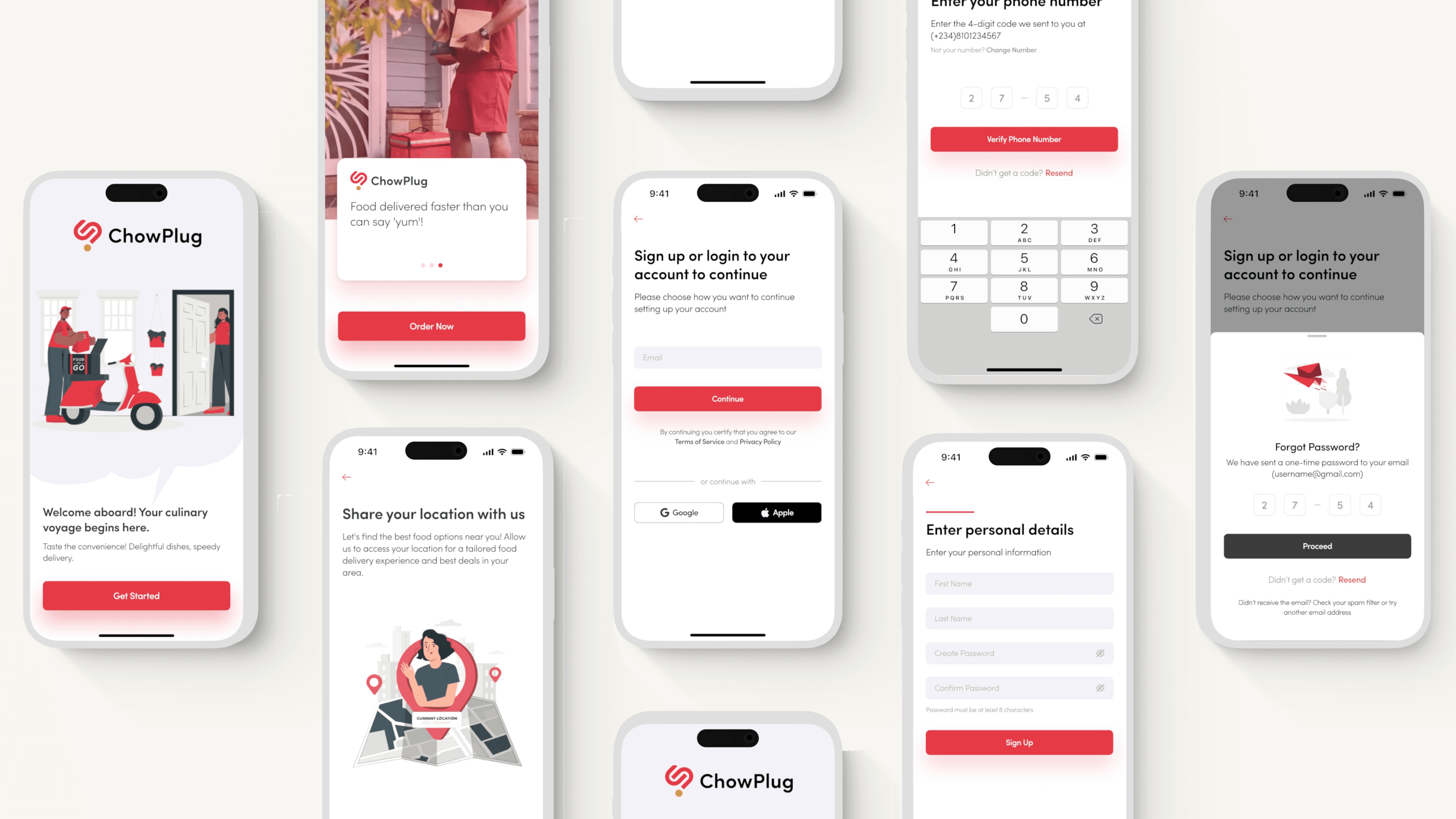
We kept the onboarding simple and straightforward while making sure users are well informed on what Chowplug has to offer. For quick access, we provided an option to skip the signup/login process till when they want to perform a major task like checkout.
Keeping the onboarding process short was on purpose to ensure a smooth user experience especially for new customers that simply want to order meals and get on with their daily activities.
The Chowplug website
Our aim was to design a promo site that is both eye-catching and informative, which would instill confidence in users and encourage them to engage with the product.
We showcased the key benefits and features of the ChowPlug app, emphasized its distinctive selling point, and illustrated an uncomplicated yet impactful approach through interactive and animated elements.
Reflective Summary
This project was more than a display of technical prowess—it was a journey of professional and personal growth. It taught me the value of empathy in design, the power of data-driven decision-making, and the importance of clear communication.
Challenges Overcomed
Navigating the complexities of financial regulations and designing for various African markets were among the challenges faced. These were overcome through persistent research, user testing, and adapting to feedback.
Thanks for reading😇
View next 👇🏾👇🏾👇🏾
Lets make something cool together, let’s connect!!
